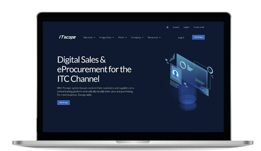
ITscope.com looks very different somehow... Because we have a new website! After many months and weeks of work, we can finally proudly present the result, the heart of our external appearance.
Following the relaunch of our corporate design and logo, it was now also the turn of the website: a brand new, modern and fresh design! Our rebranding not only applies to the new website, as the platform now also reflects the uniform ITscope design. In addition, revised content now optimally carries our positioning and brand image to the outside world. It's the result of months of creative and strategic work and we are very happy!
As the image carrier of the ITscope brand, the website now reflects much better what we do, for whom we do it and who we are. With this new digital 'business card' for our company, we not only offer you quick navigation and intuitive finding of the content you're looking for thanks to an improved menu structure, but we have also added completely new sections.
In the Solutions section, you will find our range of solutions for digital sales and eProcurement. The Integrations and Resources tabs are also new: in the latter, you will find our blog, whitepapers and our market barometer.
Relevant information that helps with your individual needs is not a given, but must be well planned and prepared. One of our underlying ideas was therefore to present this information in portions and in a clearly understandable way on our website. It's important to us that the new website offers a clear arrangement and continues to deliver the best performance, regardless of the device.
But enough about that: why don't you take a look right now?


